Work
Work I've led, and what it taught me.
Case studies from a career leading design inside complex systems, where the people doing the work mattered as much as the product being built. Most recent work sits under NDA, so the specifics are abstracted while the lessons stay intact. The last study and the section after it are products I built and shipped myself, so the screens are real.
In this collection
Enterprise transformation
Leading UX into a global enterprise transformation, mid-streamFortune 50 medtech, Microsoft Dynamics, four regions, a year of work.Read itResearch-led modernization
Understanding the systems a city relies on after every arrestA major American city's criminal justice agency, fifty-year-old systems, paper-based processes, three months.Read itShared-system design
Designing the loan-review system a federal agency and its lenders shareHUD's Federal Housing Administration, single-family mortgage reviews, paper and a legacy mainframe, the platform still in use years later.Read itConversational AI design
Building the voice members reach when they call for careA large health plan's member line, 25,000 calls a day, a legacy phone menu replaced by a conversational voice agent on IBM Watson.Read itProduct built with AI
Building the tool that runs my own searchA scoring and tracking app for one user, built with AI and running AI inside it. The demo is public. The repo is open source.Read it
Enterprise transformation
Leading UX into a global enterprise transformation, mid-stream
Took over UX delivery mid-stream on a Microsoft Dynamics transformation for a Fortune 50 medtech company. Led a distributed team across four regions through an engagement that doubled from its original six-month scope, and built the design system that became the consistency backbone of the global rollout.
Context
A Fortune 50 medtech company consolidating a fragmented regional landscape onto Microsoft Dynamics, replacing everything from a deprecated legacy CRM to spreadsheets and email.
- Our side: blueprinting, Dynamics expertise, data architecture, content
- Third-party SI: the build
- Client: directing through multiple technical product owners
- Five workstreams: Sales, Marketing, Field Service, Customer Service, Regulatory Education
- Across the platform: mobile sales application, inline AI assistants
I joined as UX lead on the consulting side just as the project moved from blueprinting into execution. The client's UX team had carried upstream research but was understaffed for execution at this scale. I came in to build and lead that delivery team.
The client, platform configuration, and design system itself are covered by NDA. My role ended before the engagement closed; what follows covers the work through that point and focuses on leadership, decisions, and outcomes.
The problem
The execution phase needed UX delivery the upstream team wasn't sized to provide. Several calls were mine:
- Where UX would play across the workstreams
- What cadence design work would run on inside an SI-led build
- How design decisions would survive handoff into sprint refinement
Dynamics is a rigid SaaS surface, so the work that mattered most was experience and workflow rather than visual craft.
What I did
Built the team and the cadence.
Assembled and led a distributed team of five to seven designers, onshore and offshore, scaled at one to two per workstream depending on need. Coordinated with an offshore director on staffing and workloads, and kept continuity through the contract shifts that reshaped the engagement. Personally led two workstreams and oversaw capable designers on the others.
Held the seam between three parties.
The people defining the experience and the people building it sat on opposite sides of a contractual seam. My team defined how UX stories landed in JIRA and how they were spec'd for sprint-by-sprint refinement. We pushed back on the SI on AI assistant placement, on UX debt per sprint, and on design system adoption. Several escalations needed the TPOs and the client's UX director pulled in to align dev teams.
Prioritized Sales first.
Sales was the workstream the client would judge our work by. It had to come first, and it had to be convincing. The others got attention as their dependencies and TPO timelines required.
Placed AI where it earned its place.
Where AI added clarity, it stayed. Where it added a layer between the user and a task they already understood, we cut it. Decided through rough personas, workshop feedback, and close attention to where users were actually slowed by retrieval or decision support.
Built the design system that became the rollout's backbone.
Atomic tokens up through reusable templates and page-level designs, with templates defined so reusable designs doubled as reusable code components.
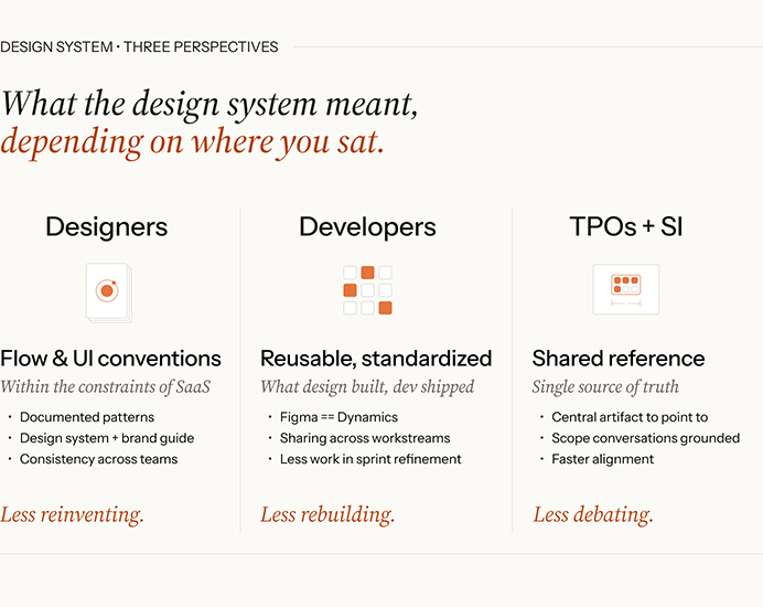
Editorial graphic titled "What the design system meant, depending on where you sat," comparing what the design system delivered for three groups.
- Designers got flow and UI conventions within the constraints of SaaS: documented patterns, a design system and brand guide, and consistency across teams. The result was less reinventing.
- Developers got reusable, standardized components, what design built and dev shipped: Figma mapped to Dynamics, sharing across workstreams, and less work in sprint refinement. The result was less rebuilding.
- TPOs and the SI got a shared reference and single source of truth: a central artifact to point to, grounded scope conversations, and faster alignment. The result was less debating.
Consistency where it helped. Flexibility where it didn't.
What happened
The design system held the rollout together.
Dev rework dropped meaningfully once it was in place; SI velocity improved on subsequent sprints. Patterns mapped directly between Figma and code: less translation work, fewer interpretation calls during refinement.
The Sales prototype landed harder than anyone expected.
Showcased during the client's global sales meeting with a polished commercial-style introduction. That was the point where the client's confidence in the UX direction really took hold.
The engagement doubled from its original six-month scope.
I helped shape the staffing and scope for the extension through my director. The client choosing to keep investing is the outcome I'd point to first.
Two designers came out positioned for promotion.
The associate designer who led Sales was given independent workstream leadership. One offshore designer hit a difficult stretch with delivery cadence and stakeholder communication; with coaching and some hard conversations, they came out with a noticeably stronger, more authoritative voice.
Two designers came out of this engagement ready for more than they came in with. I coached them through it; they did the harder part.
What I'd do differently
Lock the design system structure earlier.
It crystallized later than it should have. The first half of the work was spent solving similar problems in parallel across workstreams. Running this again, I'd lock the atomic patterns and template rules as a first priority, even if the full library took longer to fill in.
Distribute the pushback work.
Most of the hard conversations with the SI came through me. The cost was that I didn't build pushback capacity in the team as deliberately as I could have. The team would have grown faster if I'd been more deliberate about creating those moments earlier and more often.
Research-led modernization
Understanding the systems a city relies on after every arrest
Led the field research for a major American city's criminal justice agency replacing the fifty-year-old systems it uses to track more than 200,000 arrests a year. Three months from holding cells to courtrooms, turning what we found into the documentation that became the basis of its RFP to replace it all.
Context
An independent non-profit running pretrial services for a major US city, working alongside the police department, the courts, and corrections.
- The agency's role: to inform the release decisions the court itself makes
- Four programs: bail expediting, court-date reminders, supervised release, and the pretrial interview and release recommendation function
- The systems: a 1970s-era database behind green-screen terminals, paper files, and decades of established process
- The team: three to four researchers and analysts; I led UX
- The output: a roadmap, current and future-state journey maps, epics, and user stories
I led the UX work on a short, focused project. A new executive director had recently set out to strengthen the agency's core systems, some built decades earlier, with a database migration targeted a few years out. The work sat inside a broader push to modernize the city's pretrial services, coordinated by its criminal justice office. That push included a cross-agency data platform and a new release recommendation algorithm. (I led a separate, smaller engagement on the wireframes for that data platform in the same window.)
The problem
This was not a problem we could solve from a description of the system. It lived in places most people never see, and the staff who understood it best had never been asked to design its replacement. The calls that were mine:
- How to research work spread across a dozen locations and four programs
- How to synthesize four programs that looked different on the surface but ran into the same underlying constraints
- How to turn what we learned into documentation the agency could put out to bid, for a vendor who would build against it without ever being in the room
What I did
Put the research where the work happened.
We followed a case the way it actually moves through the city: the city's holding and booking facilities, the rooms where staff interview each arrested person within hours and often in the middle of the night, the courtrooms and the back offices behind them, and their own offices, including the one where the volume the system handled was visible in the paper it ran on.
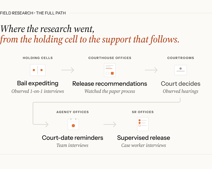
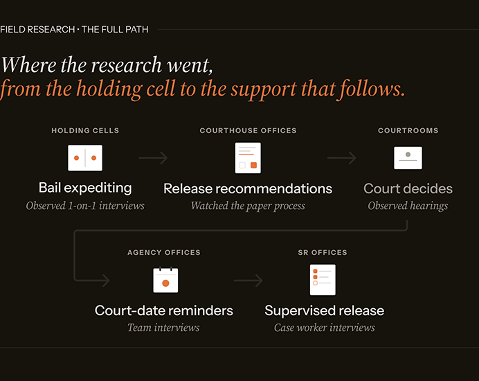
Editorial diagram under the eyebrow "Field research: the full path," headlined "Where the research went, from the holding cell to the support that follows."
The path moves through five settings, each tied to a program and a research method: holding cells (bail expediting, observed one-on-one interviews); courthouse offices (release recommendations, watching the paper process); courtrooms (court decides, observed hearings); agency offices (court-date reminders, team interviews); and supervised release offices (supervised release, case worker interviews).
You don't get an honest picture of a fifty-year-old system from a conference room.
Interviewed and observed across every level.
Leadership, supervisors, interviewers. Decades of quiet workarounds had grown up around the system to make it serve work it could not quite do. Surfacing those was most of the research.
Mapped current and future state across the four programs.
Mapping current state meant studying the systems the way staff actually used them. The core ran on an aging keyboard-driven tracking system, with a few programs on newer or separate setups. The current-state maps were finished deliverables, faithful to how the work actually ran. The future-state maps were lighter by design, made to scaffold the workshops.
Ran the future-state workshops.
Senior staff from across the programs worked the future state themselves, building on the pain points the research had surfaced: the repetitive data entry, the communication that changed hands too many times, the work that paper and green screens made slower than it needed to be. The output was a prioritized set of epics and user stories.
What happened
The documentation became the basis of the agency's request for proposals.
In its own published account, the agency described documenting current workflows and system requirements, work that fed directly into the RFP it issued for development services. The roadmap, journey maps, epics, and user stories put the agency in a position to decide what it needed from a vendor before going out to bid.
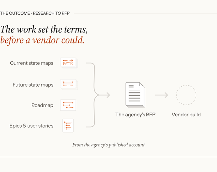
Editorial diagram under the eyebrow "The outcome: research to RFP," headlined "The work set the terms, before a vendor could."
Four research deliverables on the left (current state maps, future state maps, a roadmap, and epics and user stories) gather into a single document labeled "the agency's RFP," which in turn points to a vendor build drawn as a dashed, not-yet outline. A footnote reads "From the agency's published account."
The workshops gave staff a stake in what came next.
The people who knew the work best had shaped the future state in their own terms. That improved the documentation, and it gave the staff a stake in the outcome.
Someone was listening to how the work actually got done.
The work outlasted the engagement.
We were on site for three months. The documentation we left behind guided decisions made long after, by the team that built what came next, in the language and priority order of the people who actually do the work.
What I'd do differently
The future-state journey maps could have done more work downstream.
The current-state maps were finished deliverables. The future-state maps were deliberately abbreviated, scaffolding for the workshops where program staff mapped the future themselves. That was the right call for the workshops. The cost was that no fully illustrated future-state map existed for the vendor that eventually built against the RFP. Running this again, I'd build the future-state maps out after the workshops with what participants produced baked in. The workshops would do the same work. The maps would carry it forward to the people building the system without us there.
Shared-system design
Designing the loan-review system a federal agency and its lenders share
Designed the UX architecture for the Loan Review System, the platform HUD's Federal Housing Administration and its lenders use to run quality-assurance reviews on single-family mortgages. It replaced a process that had run on paper and a mainframe, differently in every regional center.
Context
HUD's Federal Housing Administration runs quality-assurance reviews on the single-family mortgages it insures. By the mid-2010s the way it ran them had not kept pace with the volume.
The hard policy work was already done. In 2015 FHA published a new defect standard that replaced ninety-nine legacy codes with nine plain-language categories, each carrying a source, a cause, and a severity tier. The standard existed. The system to run reviews against it did not. That system became the Loan Review System, and the UX work on it ran from 2016 into 2017, inside a larger federal modernization program.
- The client: the Federal Housing Administration.
- The standard: the defect taxonomy, set by FHA before the design work began.
- The users: FHA reviewers across the agency's regional centers, and FHA-approved lenders nationwide.
- My role: UX architecture and design, alongside the UX lead, who owned vision and the client relationship. We worked the hard problems together.
The problem
The old way moved on paper. Behind it sat a mainframe and an Excel workbook grown well past what a spreadsheet should hold. Reviews ran out of two divisions in each regional center, on separate systems, with no shared record.
The real problem was deeper than paper. A single system now had to serve two populations who wanted opposite things from it. A reviewer works like an investigator, weighing whether a loan met FHA's requirements. A lender wants the short version: a clear path to resolve a finding and move the loan along. Both had to be true on the same screens, in the same language.
The reviewer is building a case. The lender wants the loan out the door. The same screen had to work for both.
What I did
Built the experience on the defect standard.
The taxonomy was the one thing both sides already shared, so it became the spine: every finding and response keyed back to it. I mapped the review lifecycle end to end and designed the screens for each state, from a selected loan through findings, response, and resolution.
Organized the dashboard around whose move it is.
A lender's home screen splits in two: the reviews waiting on the lender, with due dates, and the reviews sitting with FHA, read-only until they come back. At a glance, a lender sees what they can act on and what they are waiting for. Filters by selection reason and review level sort the rest.
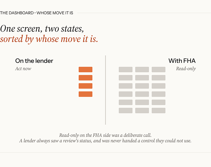
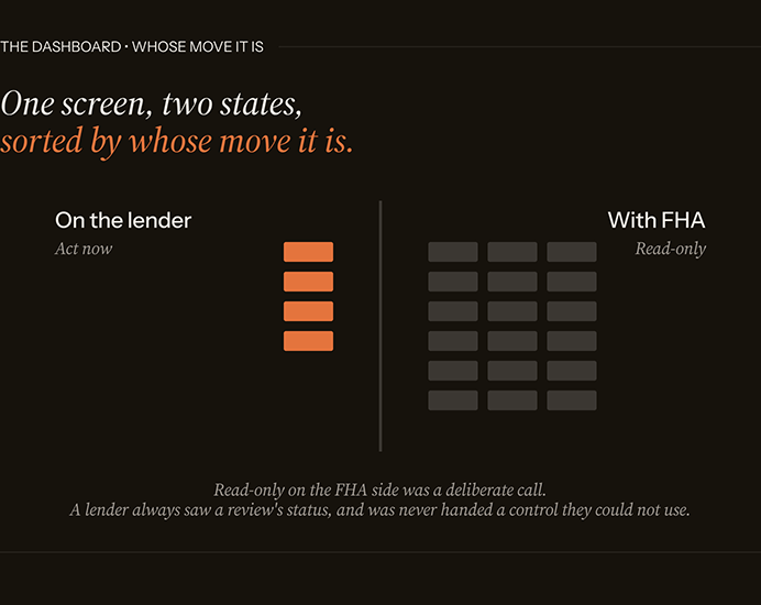
Editorial diagram under the eyebrow "The dashboard: whose move it is," headlined "One screen, two states, sorted by whose move it is."
The lender's home screen splits into two columns. On the left, "On the lender" (act now) holds a small set of active items the lender can act on. On the right, "With FHA" (read-only) holds a larger grid of items sitting with FHA, inactive until they come back. A footnote reads: "Read-only on the FHA side was a deliberate call. A lender always saw a review's status, and was never handed a control they could not use."
Kept the response flow legible as the stakes rose.
Resolving a finding is rarely one step. It escalates from an initial response through mitigation to formal remedies. I designed that path so a lender always knew where they stood and what was at risk at each level.
Tested it before code.
We designed and prototyped every screen before development began, so people could click through the system and react to it. The LRS team was our first audience, and the dashboard is the clearest example of what that gave us: my first cut at what a lender most needs to see was a reasonable guess, and their corrections made it the right answer.
We knew the craft. They knew the work. The design got sharper where we came together.
What happened
It pulled a scattered process into one place.
The launch folded several separate tracking systems into a single application and moved lender self-reporting off the old early-warning system. One workflow where there had been a patchwork.
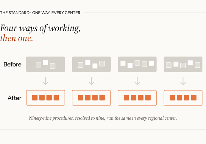
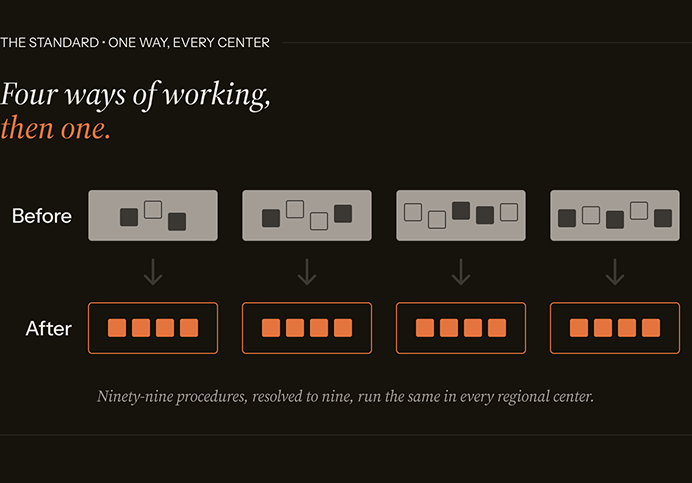
Editorial diagram under the eyebrow "The standard: one way, every center," headlined "Four ways of working, then one."
A before-and-after grid. The top row, "Before," shows four panels of scattered, irregularly placed items, each a little more crowded than the last. Arrows point down to the bottom row, "After," where each panel holds the same four items lined up in a single uniform row. A footnote reads: "Ninety-nine procedures, resolved to nine, run the same in every regional center."
Both sides gained something they had not had.
FHA got reviews that ran the same way across its regional centers, against a single standard. Lenders got a clear view of every finding and a structured way to respond.
The system shipped, and it stuck.
LRS went live in 2017 and became the platform of record for the majority of FHA's Title II single-family quality-assurance reviews. The architecture held, and work continued on it for years after we finished, under the same technical lead.
What I'd do differently
I would have put the design in front of its real users.
Direct testing with them was not in the contract or the schedule, so we designed with the LRS team instead, experts who had run these reviews for years. The work was better for it. You design with the room you have.
But people who know a process stand in for the people who live it, and user testing is the first thing cut from a budget and a timeline, seldom the cheapest thing to skip. The quirks it would have caught got worked out later on the dev side, over the years that followed.
Conversational AI design
Building the voice members reach when they call for care
Members of a large health plan needed to find the right in-network provider, and called in for help doing it. We replaced a legacy menu system with a conversational voice agent they could talk to, built on IBM Watson.
Context
The menu system that met callers was a dead end for many, and answering those calls with live agents was expensive.
- Our side: two designers co-leading voice and conversation design, guided by a director.
- The client's side: their own UX team, with linguistics and subject-matter depth.
- The program: a large cross-functional effort run from the consulting side, with telephony, conversational AI, integration, and design as coordinated tracks.
- The platform: IBM Watson. Assistant for dialog, Speech-to-Text and Text-to-Speech for the voice, Voice Gateway for the phone line.
The client is under NDA and stays unnamed here. The platform and the shape of the work are described where they're already public, including a later-published client story.
The problem
What members asked for was simple: the right in-network provider. Building the line that could find one for them was not.
A voice agent has no screen to lean on. Nothing shows a caller what they can ask for or where they are in the process. Everything a caller learns, they learn by ear, often while already frustrated by the time the line picks up.
The simple request had more behind it than it let on:
- A wide range of callers. They varied in age and accent, and in how well they could hear. The agent had to be understood by all of them, and understand them in return.
- A large matching space behind a plain request. Finding the right provider meant working out location and specialty from what a caller could say, whether that was an exact specialist or just "a doctor."
- Callers who leave the script. People interrupt and wander, and they say things no dialog tree planned for. Part of the design was knowing when to stop and hand the call to a human.
What I did
I led UX alongside another designer, with the conversation and persona work shared between us. We co-designed the visual handoff. The voice realization and the edge handling were mine.
Researched the voice before designing it.
We started with the agent. Who it was, how much personality belonged in a call about care and how much got in the way. How a voice is received isn't only a matter of clarity. People respond to a voice before they've parsed a word of it, and that reception shaped the persona as much as the words did. That research defined the agent, and the dialog followed from it.
Mapped the conversation, branch by branch.
A request as plain as finding a doctor opens into a wide space behind it, from where the caller is and what kind of care they need to whether they're calling for themselves at all. We mapped how the conversation moved through that space, where it branched, and how it had to recover when someone left the path. The map ran to hundreds of conversation points.
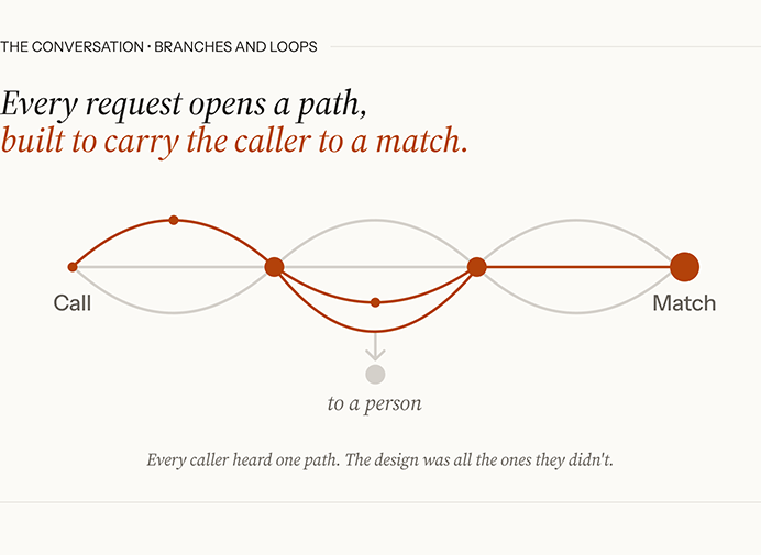

Editorial diagram under the eyebrow "The conversation: branches and loops," headlined "Every request opens a path, built to carry the caller to a match."
A single terracotta path threads left to right from Call to Match, arcing above and below a straight gray baseline as it branches and loops through a series of nodes. Gray arcs show the alternate branches not taken. Partway across, one branch drops to a separate gray node labeled "to a person," the handoff to a human. The endpoints are labeled Call (a small dot) and Match (a large terracotta dot). A footnote reads: "Every caller heard one path. The design was all the ones they didn't."
Chose the voice that worked for callers.
The set was limited, so the task was picking the one that held up. Pitch and voice character affect how well a hard-of-hearing caller can follow what they hear, so the field narrowed on intelligibility. Brand mattered, but it sat behind being understood.
Got the words right.
A provider directory is full of terms a synthesizer mishandles: clinical specialties, member and place names, email domains. I found the ones it got wrong and specified the fixes in SSML and IPA for the linguists and developers. Prosody worked the same way: I identified the problem and specified the fix. They built it.
Designed for the messy edges.
People don't stay on script. Some test whether they're talking to a person, curse at the agent, or try to befriend it, and some say things no dialog tree planned for. I designed those paths: recognizing when a caller asked if it was human and answering without breaking the agent, and judging when to stop and route the call to a person.
Handed structured results to a screen.
The results went to the caller's phone or email as a link to a list and map, where they could filter them and choose from there. Anyone who wanted them read aloud still could if that worked for them.
Voice is good for understanding what someone needs. It's a clumsy way to hand back a list no one can remember.
What happened
The line went live for a wide range of callers.
The system that shipped supported callers across differences in age and accent. Someone already frustrated, or straining to hear, reached a line that listened and answered in plain language. The callers who gained the most were the ones the old menu had failed hardest.
The matching did what the plain request needed.
The agent held context-based conversations and returned in-area providers filtered against a member's plan and network. The agent narrowed that space by asking, turning a vague request into a specific match.
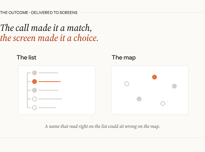
Editorial diagram under the eyebrow "The outcome: delivered to screens," headlined "The call made it a match, the screen made it a choice."
Two panels side by side. On the left, "The list," shows results as a vertical stack of rows, each with a leading dot, one row highlighted in terracotta and the others gray or unfilled. On the right, "The map," shows the same results plotted as dots scattered across a two-dimensional space, again with one highlighted in terracotta. A footnote reads: "A name that read right on the list could sit wrong on the map."
The careful paths held.
The agent handed the call to a person when it went past what it should handle. Off script no longer meant a dead end.
The old menu failed callers. The new line guided them to the provider they needed.
What I'd do differently
Test wider, and earlier.
Validation was the weak link, and the reasons compounded. A dev line was the only real environment, so testing was slow, and the only way to hear how the conversation worked was to call in. We leaned on our own voices to check it. That left the callers most exposed to a voice that wasn't carefully built, the ones straining to hear or working through an accent, least present in the testing meant to catch what would fail them. The tools didn't help: general-purpose ones pressed into mapping and tracking, they made the conversation hard to see whole and harder to test systematically. None of this sank the work. But the next time I designed for a voice, I'd build the test around the people most likely to struggle with it, and not trust my own ear to stand in for theirs.
Product built with AI
Building the tool that runs my own search
A scoring and tracking app for one user, built with AI and running AI inside it. The working version took an afternoon. Deciding what it accepts, what it scores, and what it refuses took two months.
Context
A job search runs on time, and most of mine was going to job boards. I built a tool to take the boards off my plate. It watches the companies I care about, pulls their postings, scores each one against criteria I set, and keeps the rest of the search in one place.
- The tool: Job Search HQ. Local-first, one process on the user's own machine, data in a SQLite file they own. No accounts, no tracking.
- The team: one designer, working with Claude Code. Most of the code came from AI, and AI does the scoring and drafting inside the app.
- The stack: Python and FastAPI, a framework-free web frontend, the Anthropic API for scoring and drafting.
- The demo: a public instance running a fictional job seeker on the real pipeline. Every screen on this page comes from it.
A product for one person, built by one person, is easy to discount. What this study shows is the design judgment underneath it: what the system accepts, what it scores, what it refuses, and how each of those calls got made.
The problem
The working version was cheap. A tool that pulled postings and scored them ran the same day I started. Everything after that was a decision the system had no way to make on its own:
- What a posting has to pass before it's worth reading. Location, compensation, and level are hard filters. A posting that fails one never reaches the scorer.
- How a surviving posting gets compared to an ideal role, and how that comparison stays readable enough to argue with.
- What "healthy" means for a feed a person will act on. A monitor can pass a feed that has stopped changing.
- How a drafting model stays in my voice, so a note it writes starts close to what I'd send.
What I did
At this scale there was no handoff. I made each call and built it, usually the same day.
Built the screening tiers.
Hard filters run first: a compensation floor, a commute radius, excluded sectors, a seniority band. A posting that fails one is out before any model reads it. What survives goes to scoring, and scoring runs against a ranked list rather than a checklist.
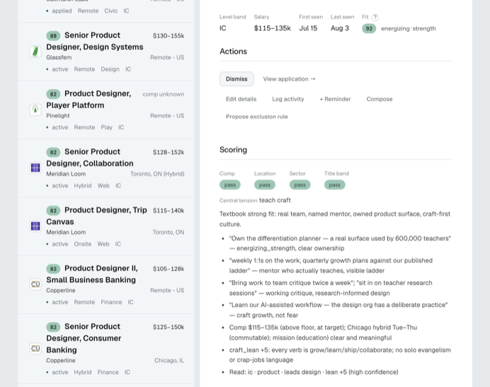
Product screenshot from the public demo. On the left, a list of scored postings, each with a score badge, company, location, and tags. On the right, one posting's detail: level band IC, salary $115 to 135k, first seen Jul 15, last seen Aug 3, fit 92 labeled "energizing, strength." Under a Scoring heading, four gates read Comp, Location, Sector, and Title band, each marked pass. A line reads "Central tension: teach craft," then a one-sentence summary and seven bullets, each quoting a phrase from the posting and naming the criterion it maps to, ending with the read: "ic, product, leads design, lean +5 (high confidence)."
Wrote the rubric so I could argue with it.
The criteria document is a ranked wish list in my own words. Rank is weight; there is no separate importance setting to drift away from it. Each score comes back with its reasoning, criterion by criterion, so when a number looks off I can find the line that drove it and rewrite the line. The rubric and the tier rules are both editable in Settings.
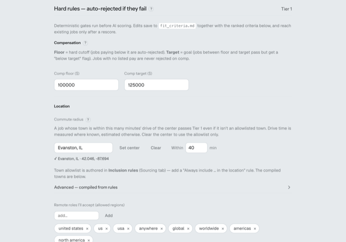
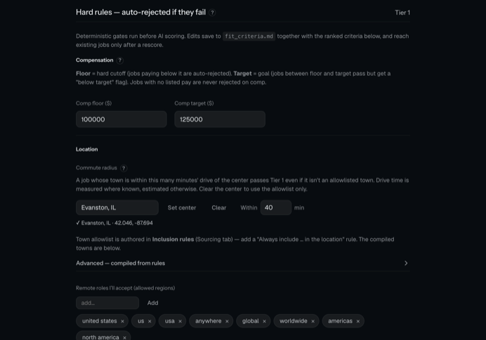
Product screenshot from the public demo, Settings, Scoring tab. A heading reads "Hard rules, auto-rejected if they fail," labeled Tier 1, with a note that these deterministic gates run before AI scoring and save to the criteria file together with the ranked criteria. Under Compensation, a floor of 100000 and a target of 125000. Under Location, a commute radius: center Evanston, IL, within 40 minutes, with an explanation that a town inside the radius passes Tier 1 even if it isn't on the allowlist. Below, a row of accepted remote regions as removable tags: united states, us, usa, anywhere, global, worldwide, americas, north america.
Wrote the dead-feed rule.
Nothing in the pipeline could tell a live board from a frozen one; both returned well-formed rows. The rule I settled on: if a feed's newest posting is older than ninety days, the feed fails with a banner before a single row is ingested. Ninety was a judgment call rather than a measured threshold.
Put a voice guide behind the drafting.
The model that drafts notes reads a voice guide and a persona set in Settings. The target is a first draft that needs an edit rather than a rewrite.
Built the checks that catch me.
Adapter tests recorded against fixtures for every job board the app reads, so a board that changes its markup fails a test instead of quietly emptying a feed. A calibration gate on scoring, so a rubric change that moves every score has to be accepted on purpose. Live verification before a change lands.
What happened
It runs the search every day.
Refresh runs on a schedule, pulls the boards, screens and scores what came in, and the day starts from a short scored list. The demo is public and the repo is open source under AGPL.
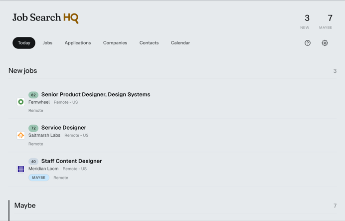
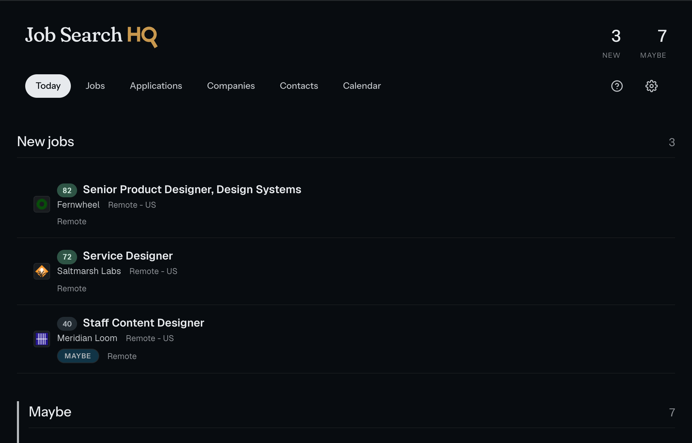
Product screenshot from the public demo, Today view. The header shows counts of 3 new and 7 maybe. A "New jobs" section lists three postings, each with a score badge, title, company, and location: Senior Product Designer, Design Systems at Fernwheel, remote, scored 82; Service Designer at Saltmarsh Labs, remote, scored 72; Staff Content Designer at Meridian Loom, remote, scored 40 and tagged Maybe. A "Maybe" section begins below.
The dead feed was caught by what was missing.
A senior design manager role I knew was live on a company's careers site never showed up in the app. Every monitor said the feed was fine. Going back to it showed the count frozen and the dates stopped. The ninety-day rule came out of that, and it now runs on every feed before ingest.
Every rule in the system came from a failure I had to notice first.
A score got corrected by eye.
A score came back one day off from the number I'd seen an hour earlier. The log showed the cause, a change upstream, and gave no sign the change was wrong. I fixed the scoring and the number returned to 82. The system reported that everything was fine at each step; the correction depended on my knowing the right number beforehand.
Still open
Built and tuned for one user.
The criteria, the tiers, and the voice guide were written against one search: mine. A round of testing with other job seekers is under way, and the results are still coming in. What I'm looking for is whether the parts I tuned by hand hold up for someone else: a criteria document another person can write without seeing mine, tier defaults that fit a search unlike mine, and a voice guide that produces a draft someone else would send. The HUD and Watson studies name the same limit, testing with the room you had. Here the test is still running.
Open source
Some things I built and shipped myself, outside the case studies. The code is public, the screens are real, and each one exists because a gap in my own life needed closing.
Grade monitoring for families
Find out about the missing assignment the day the teacher flags it
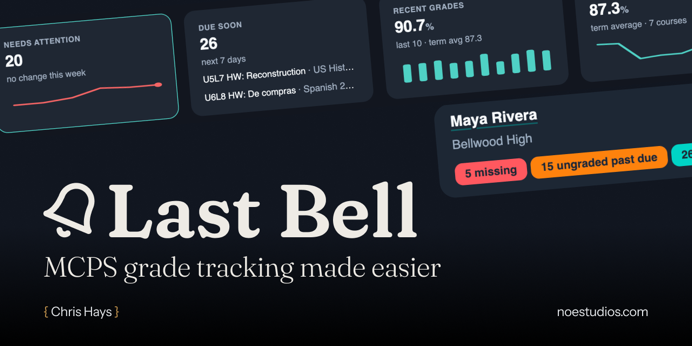
A parent usually learns about a missing assignment the night before report cards. Last Bell watches a student's ParentVUE gradebook and Canvas coursework from a computer the family owns and tells the people who should know as soon as it appears. The design work was in who hears what. A guardian gets one digest at 4pm, with urgent items sent right away. A student gets nudges about deadlines and missing work; grades stay with the guardian. Every message carries initials rather than a name, so it's safe on a lock screen. Text messages were refused on purpose: the carrier email-to-text gateways are shutting down, and a channel that reaches some people and silently drops others is worse than none.
Claude Code skill
Alt text by image type, decided one image at a time
A skill that takes a folder of images, or a parent folder of project folders, writes alt text for every image, and hands back one document per folder plus a master index. The W3C's guidance sorts images into types, and each type has its own rule: a decorative image gets empty alt, text in an image gets transcribed, a chart gets a short alt and a long description. The skill works from five of those types. Sorting an image into one means knowing what it's there to do, so the skill reads the surrounding document before it writes, and it describes people by role and action.